I've just come back from Brunswick Council gallery and their two current exhibitions: a groups show called Trouble in Toyland and Keiko Murakami’s Kizuguchi. I have to say, I was a little disappointed by both.
The stand out artist was Van Sowerwine, with 3 huge photographs and an amusing stop motion animation. The photographs are dark and menacing, each featuring a single toy in a human like fashion that stop you in your tracks. Sowerwine was also the artist behind Play With Me, an installation I saw at the CCP in 2002 which I loved. She captures disturbing moments in both her animations and images with leave the veiwer just that little bit unsettled.
Anna Hoyle exhibited tiny glittery inks like watercolours, little scenes of animals racing around. Although techically they were amazing, I felt that the words she added around and through the work only really detracted from it. They were an unnessecery speedhump to enjoying the work.
Other work was a cute sculpture by Martine Corompt The Anxious cat, Christopher Langton’s towering inflatable Captain America like Plastic Man and Michael Doolan’s metallic looking ceramic toy figures.
Curatorially, I wondered how the art interacted with each other. Sowerine's work was in one corner. Hoyle's work occupied a little nook of it's own. Doolan's work inhabited a glass case, totally cut off from the gallery space or the other work. I felt that every grouping of work was separate to every other, rather than the exhibition being one coherent whole. And that might be partly the odd shape to the gallery itself. You can't really flow around a room that has a doorway to another gallery in the middle of one of the walls and a nook like space attached to another wall. I do think that almost all spaces can be worked with, but there was something a little stilted in the presentation of this show, which was a shame.
The second exhibition was Kizuguchi, which is explained in the catolouge as "the exhibition’s title ‘kizuguchi’, means a “wound or cut to the body” in Japanese." Most of the work was a gothic lolita style doll figure looking out of the frame with a wound somewhere on her body. The same pose and the same face just painted in different colours seemed a little lazy to me. Unlike, say, Hazel Doony's Dangerous Career Babes, where the exact same pose but different props and costume are utalised to great effect, Murakami's paintings arn't different enough to be different, but arn't similar enough to work as an exploration of pose vs props. The other problem with most of her works is that they're very, very similar to a lot of other work I've seen in this style. This might be because she's on the cutting edge of cool and popular or it might be that everybody's doing it.
She did have some lino prints of a weird shape that stood in for a head, with a weeping eye and tiny bodies, and I thought they worked much better than her other works. They conveyed emotion without being overly cheesy and they showed a well thought out use of colour and shape. It would have been great to see more of these
Wednesday, January 21, 2009
Friday, October 10, 2008
HANA - The Essence of Life
I haven't seen many exhibitions during Fringe, which disappoints me a little, but I've been so busy with Totem that I jsut haven't been able to find the time.
But I did drop by Collingwood Gallery on Smith St to see Hana, an exhibition from 30 Japanese artists on the theme 'The essence of life'. The word Hana means 'flower, essence, spirit and beauty'.
The styles are incredibly diverse, from Izumi Ishihara's graphic style to Kou's oil on board works reminiscent of looking at old children's book characters through the sepia haze of time. I really liked these paintings
There was Misa Tsutsui's work, which was a style recognisable from the Sailor Moon type characters. A single figure on each canvas, pretty but not really remarkable. Kisho Tokutomi's work, jsut around the corner, were incredibly detailed, again the single figure but this time with highly patterned kimino garments and executed beautifully.
There were also landscapes, absracts, highly graphical work to the traditional (and beautiful) black ink Shodo work. On the other side of the gallery were some 3d objects, hats, and some incredibl silver and pearl jewellery. One of my favourites was a number of sweet sculptures from Nazomi Ueno called "It's my turn, bear" "It's my turn, rabbit" "It's my turn, mouse" and "sloth" These were 4 small sculptures on wooden plaques of a wooden chair with the aforementioned animal sitting and fishing off it, except "sloth" which was the same size and shaped plaque but with a little sloth hanging off a hook. Very cute.
Hana was an interested window into another culture's art world. You can see traditional influences and artists applying those influences to modern situations. It didn't really make me think, but i did spend an interesting half an hour in there.
Friday, September 19, 2008
bare with me
I know I haven't updated this blog in a while, but I'm currently organising an exhibition called Totem: Dolls with Souls as part of the Melbourne Fringe Festival to be held at the Fracture Galleries in Federation Square.
Totem is a collection of dolls created by artists to reflect how they truly feel themselves to be. These dolls are more than just simple childrens toys, they are powerful symbols of who we think we are, the internal workings of the human mind given form and are honest, heartfelt expressions of self.

for more info go to http://www.melbournefringe.com.au/season/2008/show/259/
We will return you to you're regular programing jsut as soon as we are able!
Tuesday, August 12, 2008
Containment and Klaus Rinke
About a week ago I happened to be in the RMIT School of Art and Ceramics gallery. I wandered into the show, CONTAINMENT, not having any idea about the show or the artists.
As you see more and more exhibitions you grow to understand more and more what you like and what you don't. You also grow to understand what media you're drawn too and what you arn't. Ceramic sculpture has never really grabbed me. I can appreciate it, but it doesn't draw me in like photography or soft sculpture. Maybe that's because I'm not a ceramist, I've never really worked in clay. I don't really know, but whatever it is, I was dubious about finding anything I liked in this show.
I was wrong.
The first artwork I came across was Sally Cleary's series of 9 exquisite works of fired clay and found feathers on photographs. They capture perfectly the experience and feel of discovery of objects on the ground and in trees, presenting debris caught in branches, down drains and at the paths edge. They captured my attention for ages, they were so beautiful.
There was also Tina Lee's The Karens, which was the same 70s squat vase cast over and over and glazed different soft pastel colours, laid out in a tear drop shape on the floor pointing towards the viewer. The physiology of the mass produced is comforting to us because it's everywhere (from Lee's artist statement). The Karens embodied this really well. I wonder though, had I not have read the artist statement, whether i would have understood the comforting nature of this artwork or rather would I have viewed it as a statement of the blandness of mass produced repetition. Either way, there was a heartwarming 'waitingness' to the vases, as if they sat there patiently waiting for people to take them home and love them.
I also wandered over to RMIT gallery, and saw Klaus Rinke's recent drawings. Rinke is an German abstract artist, a leader of the avant-garde in Germany, says the press release. The exhibition is comprised of huge charcoal drawings that stretch from floor to ceiling. The charcoal is on rough, unfinished canvas and it's beautiful. I love being able to see the physical artistic process in the work. The works are, for the most part, huge organic shapes outlined with a thick black line and then shaded. Rinke has used a huge brush in parts, dragging through the pigment which marks the charcoal like pencil lines. And the very size of them (the smallest being 370x285cm) completely dwarfs you. But for all that, I'm still not sure what he's trying to say. I find abstract work more difficult to interpret than I do with ceramics, so it was a day of non-easy art all round. I find with abstract work that you need a path into the piece, a way into understanding. Often that can be the title of the work or the exhibition. But Rinke isn't always partial to helping in that regard.
Wandering around the gallery, trying to understand the work, I find one with a predominant dark shape that reminds me of a replica Queen Nefertiti bust my mother had when we were growing up. It's called She-Untouchable which is pretty cool, I figure that fits well with my connection to it. But across the room there are two that are very similar in shape to each other which are called The Curious One and Top-Heavy. The Curious One has a shape suggestion of an owl, with a circle where the eye should be, which helps with the overall owl feel. The Top Heavy title seems to refer only to the shape itself. I'm not sure why one is given such a suggestively descriptive title when the other is more shape related.
Papa-syndrome is suggestive of a child's head looking diagonally up to a totally abstract shape. Is it referencing the missing or distant father-figure that comes up time and time again? I'm not convinced this is it. The composition doesn't seem to lend itself to a father trying, and failing, to comprehend his child either. I stand in front of it for a couple of minutes trying to figure it out, but I just can't.
The largest piece is called My Egyptian Family, which is composed of two people shapes on the left and the rest is taken up with a huge and complicated shape that seems familiar but I just can't grasp what it is.
I leave having seen some beautiful art that I didn't fully understand.
Tuesday, August 5, 2008
History part 5: A Minor Collection of Unnatural History
2007's show was A Minor Collection of Unnatural History at Off the Kerb gallery in Collingwood.
It was based on the natural history section of a museum, where you walk in and are presented with say a little display of a possum, which consists of a drawing of a possum, a photograph of it in it's natural environment, a little paragraph about it and a taxidermied possum. I wanted this experience but with monsters. But not the monsters everyone knows, dracula, werewolves ect, everyone knows about those kind of monsters. I was interested in 'previously undiscovered' monsters. Myself and graphic artist Benj Dawe came up with 15 new monsters each, he drew his and I built mine in photoshop. We then swapped and created eachother's in our seperate media. So then we had 30 monsters with names and stories. I then contacted a number of artists to build the monsters in sculpture.
I wasn't interested in the artists using the images we'd created as blueprints, if I'd wanted monsters exactly as the images descibed I would have built them myself. Instead, I wanted the artists to use the images and stories as a launching place for them to then make the monsters their own.
While the artists were out building their monsters, Ben and I worked on making the images and stories into a book that we'd then sell at the show as well. We were fond of all the monsters, and we wanted them all to have a presence in the show wether they were chosen by the artists or not.
We had decided on 15 monsters on display for the show, so we needed 15 artists. Unnatural History had the largest drop out rate of any of the shows. That was quite stressful, because we needed the specific quote of artists to make the show work. So each time an artist dropped out, I had to replace them. As it was, 2 of the confirmed artists didn't turn up with work, so I printed up 2 little cards that read "The museum regrets to inform it's patrons that this monster has escaped" It was the right solution, I couldn't remove two of the monsters from the already sparce show because two of the artists didn't make it.
The sparcity of the show was a deliberate decision. Unlike Dead Bugs or Dirty Wonderland which were both packed to the gills, a museum is laid out with less exhibits, and I wanted that experience for the audience.
Images of the show can be found at www.omnificassembly.com/oa/unnatural.html
For the opening, I asked Ben Mckenzie
Melbourne comedian and scientician to do it. He'd done a fantastic job at Dead Bugs, and he didn't disapoint. For Unnatual Histroy, he spoke about the science of cryptozoology, which is the study of monsters. We also had wine and monster cupcakes, a number of artists made cupcakes with monsters on them. They were very cute and a huge hit. They were all gone by halfway through. we sold a number of books and a number of the artworks, which always makes you feel good when you leave.
Wednesday, July 30, 2008
History part 4: 21 Dead Bugs as a Gift
In 2006 came 21 Dead Bugs as a Gift. It occurred to me that art exhibitions rarely cooperate with artists of other streams, like musicians or writers, and so I set out to change that. So 21 Dead Bugs as a Gift was conceived, which would invite artists, musicians and writers, or those that work across several of those media, to respond in whatever form they wished to the title phrase. If someone created a song, it went on the album. If someone wrote a response it went into the zine, and if someone made an artwork it went into the exhibition. It was billed as:
One project in three collaborative parts
I always feel like a kid on Christmas morning when artists drop off their work on the specified day. They come in with armfuls of incredible art based on an idea I've come up with, it's an honouring and humbling experience. And Dead Bugs was no exception. One of the reasons I love curating shows is that I love seeing what other people make. Like with 21 Dead Bugs as a Gift, I knew where the phrase came from and what it referred too, and I knew what I would make. But what I was interested in is what other people would make.
Creating a theme for an exhibition is asking the artists a question. And I always know my answer to the question, that's easy. What I'm interested in is other artists answers.
And that's why I love the day they drop their work in. Because that's the day I get to see the answers to my question. And I'm endlessly fascinated about other people's answers.
Dead Bugs had video art, crochet and jewelery, a soundscape and sculpture as well as the more traditional photography, drawing and painting.

To the left is a photo of the show. At the front is crocheted work from Natasha jade, and behind is Roslyn Quin's woodwork. More images of the show can be found at www.omnificassembly.com/oa/21db.html
Dead Bugs was a challenge to organise. All exhibitions have their own difficulties, Dead Bugs with it's zine and album to organise as well as the show itself was a big job. There were over 30 artists attached, as well as the zine to colate and the cd to colate and then master. We had a few artists drop out, however the structure of the exhbition was such that I could continue to invite artists to participate in the show itself upto the week before it opened. This meant that drop outs were the least of my problems. The challenges of this show was that I'd only ever made one zine, and that was a mainly imaged based one I created one day at the office when I was terribly bored, and I'd never been involved in any way in producing an album. For the zine, a friend of mine, Benj Dawe, who was helping with the show, found Richard Keddell, who colated the zine for me, mostly during a holiday in New Zealand with a dodgy internet connection.
For the album, I spoke to Marcus Teague of Deloris for the initital stuff and then was in contact with Dan Walker who also mastered the album.
The exhibition was opened by a few performers from the show, Adam Ford a Melbourne poet and novelist who submitted a few pages to the zine, performed some poetry, Ben Mckenzie
Melbourne comedian and scientician, gave a 10 minute lecture about insects, and Rohan Voight, who appeared on the album, gave a 10 min acoustic performance.
I think it makes a gallery opening more interesting to have a performance there. You can go to an opening and check out some stuff on the wall with a glass of wine, but there's often room for something else. In Dead Bugs, with the zine and the album on sale, it seemed a little like a market, so I printed and sold tshirts and other clothing with the logo on it as well. It was a nice little inclusion that allowed the audience to take part in the show. we sold a number of packs and shirts, and a number of artworks sold from the show, which is always nice.
There are a few album/zine packs still available.
21 Dead Bugs as a Gift album and zine pack.
A 30 page zine and 10 track album from the exhbition 21 Dead Bugs as a Gift.
Cost (plus postage): $15 via Paypal.
Tuesday, July 29, 2008
History part 4: Dirty Wonderland
Dirty Wonderland: the sideshow is never what it seems
Straight after Dorian, and when I say that, I mean only a month after it, came the next show, Dirty Wonderland, an exhibition of photographs and curiosities at Vanguard Gallery in Northcote. It was composed of three artists, Soncha Iacono, Ilona Nelson and myself, but features work by a couple of other artists as well, including items from the theatre in decay collection of puppets and masks.
This was a very busy exhbition with over 100 works crammed into a small room. We filled it from floor to ceiling, every nook and cranny had things in it up to and including the fusebox. The gallery owner was a little more worried each day as we bought more and more armfuls of work inside and arrayed them out. But the carnival is a hugely busy experience and sensory overload is common. We wanted to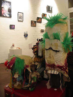 re-create that experience in a white gallery room, which I think we sucessfully did.
Tbe image is clown head masks by Robert Reid from the theatre in decay collection, and behind on the walls and floor artwork from Soncha Iacono, Ilona Nelson and Sayraphim Lothian.
The gallery owner had asked us not to invite too many people to the opening, he said he found found it very difficult to sell works to people when there were too many people in the gallery.
Myself and the other two artists discussed this, but we all felt that openings are more about allowing as many people to experience the show rather than making a few people buy a couple of pieces of art. We agreed that at this level, it's more about showing as many people as possible the stuff we do and that selling work, while nice, is secondary to that. So we sent out invites as usual to everyone we could think of.
For the opening we hired a fairy floss and icecream van, and many of the attendees again dressed up for the occasion, so we had a room packed full of people in sideshow type costumes eating icecreams and admiring the artwork. It was a beautiful experience to be a part of, and we did end up selling a couple of pieces at the opening.
Straight after Dorian, and when I say that, I mean only a month after it, came the next show, Dirty Wonderland, an exhibition of photographs and curiosities at Vanguard Gallery in Northcote. It was composed of three artists, Soncha Iacono, Ilona Nelson and myself, but features work by a couple of other artists as well, including items from the theatre in decay collection of puppets and masks.
This was a very busy exhbition with over 100 works crammed into a small room. We filled it from floor to ceiling, every nook and cranny had things in it up to and including the fusebox. The gallery owner was a little more worried each day as we bought more and more armfuls of work inside and arrayed them out. But the carnival is a hugely busy experience and sensory overload is common. We wanted to
 re-create that experience in a white gallery room, which I think we sucessfully did.
Tbe image is clown head masks by Robert Reid from the theatre in decay collection, and behind on the walls and floor artwork from Soncha Iacono, Ilona Nelson and Sayraphim Lothian.
The gallery owner had asked us not to invite too many people to the opening, he said he found found it very difficult to sell works to people when there were too many people in the gallery.
Myself and the other two artists discussed this, but we all felt that openings are more about allowing as many people to experience the show rather than making a few people buy a couple of pieces of art. We agreed that at this level, it's more about showing as many people as possible the stuff we do and that selling work, while nice, is secondary to that. So we sent out invites as usual to everyone we could think of.
For the opening we hired a fairy floss and icecream van, and many of the attendees again dressed up for the occasion, so we had a room packed full of people in sideshow type costumes eating icecreams and admiring the artwork. It was a beautiful experience to be a part of, and we did end up selling a couple of pieces at the opening.
History part 3: The Attic of Dorian Grey
 That year, in fact just after Kitty, was when I decided that I'd start organising group exhibitions and that I needed a name for it. I wanted something recognisable, something that people would remember. I came up with Omnific Assembly, a group of people that creates all. Looking back, Kitty was the first OA show, I was just a little late with the intellectualising of it.
 So the first official OA show was The Attic of Dorian Gray, which was the interval exhibition for Dancing with Strangers Melbourne Fringe Festival show Art Murder, Pictures of Dorian Gray. Dorian Gray was an Oscar Wilde story of a decedent man who never ages. The exhibition was based on the premise that if Dorian had traveled the world for 100 years, what would he have collected in his attic? It was a breathtakingly beautiful exhibition and I was very proud of it. We had costumes, installations, delicate sculptures built from bone, a huge machine rusted and covered in cobwebs, several steel sculptures and a fortune telling machine. The image to the left is (front) Sootie, a costume designer and behind are artists SaraMae Bell (left) and Marlo Spikin(right).
More images can be found at www.omnificassembly.com/oa/dorian.html
History part 2: Kitty Serendipity
4 hours. 6 Performers. 7 Cameras. 500 shots. 1379 words. 8 digitally manipulated images. 60 cross-processed photos.
2 weeks of exhibition

In an effort to weave it as tightly as we could, the models were given cameras to photograph themselves, each other and their experiences in the shoot, often capturing the photographers in the middle of photographing the models, focusing or clicking the shutter.The image is of Robert Reid photographing Ilona Nelson and it's one of my favourite. In fact, I made it the flier image. There were also 8 digital images, made up of photographs and closeups shot on the day. I then gave each of them to the collaborators and they wrote something about the image. These words I then worked into those images themselves.
And everything was shot at the Kitten Club, the venue for the show itself. Any more tightly wound and I wonder if the universe would have imploded.
I wanted to create something special for the opening night, so I invited burlesque troop Voodoo Trash Dolls to perform. The place was packed to the rafters and heaps of people dressed up to attend. I was really happy with both the show and the night. The cute bartender who made up a rose based cocktail especially for the occasion and insisted on giving me them all night just topped it all off :)
And about a third of the artworks sold, which is always nice.
History part 1: Kaidan
I've been thinking about myself as curator and I thought it would be good to write a history of it all. You need to know where you've been to understand where you are going.
So my first exhibition organised outside of Uni was for Impresaria's Kaidan Short Works Project on at the Storeroom in 2002. I was the assistant designer for the show, which included not only the stage and theatre but the front of house area, the stairwell and the room that held the bar. Kaidan is Japanese for 'ghost', so myself and the desiger, Kathryn Sproul, created huge light shades covered in white old-fashioned clothing. We decorated the whole space, but with what I don't remember anymore. The producer, Anniene Stockton, also wanted an art exhibition as part of the night and she asked me to curate it. So I got in touch with a number of artists I knew, who in turn bought a couple of their friends along and we all created art based on ghosts and forgotten memories for the show. I remember one artist, Sharon Chin, making a huge (wall to floor) paper lantern created from hundred of cigarette papers. I made an empty frame with tattered bits of white rags hung from it and there were a couple of hauntingly beautiful artworks from SaraMae Belle and Ilona Nelson.
I didn't document it as well as I could have, or indeed really at all. In my defence, I did shoot a roll of film of the exhibition itself, but I haven't seen the photos in years and so I think it's pretty safe to say I don't know where they are anymore. So Kaidan drifts gently down the path of memory and away.
Which is sort of fitting now that I think about it.
Subscribe to:
Posts (Atom)